

I mentioned previously that I have been working with a local hospice program's fundraising event called Art & Soup. I'll be the first to admit that some years have turned out better than others. My background is interior design not flowers so there's been a lot to learn in a brief amount of time. I've had to work within the confines of a tight budget every year- and a lot of areas to cover on said budget. The first year, I was the assistant but the day of the function I became the lead since the friend that got me started with A&S moved the night before. One year, I was requested to recycle as much stuff in storage as possible from previous years functions. That one was a scary hodge podge verging on disaster. It's been fun though and overall, I'm proud of what I've done and how the events have turned out.
I recommend attending this event; the art is great and the sampling of food is even better! Look for it late March- early April 2011. I'll keep you posted.
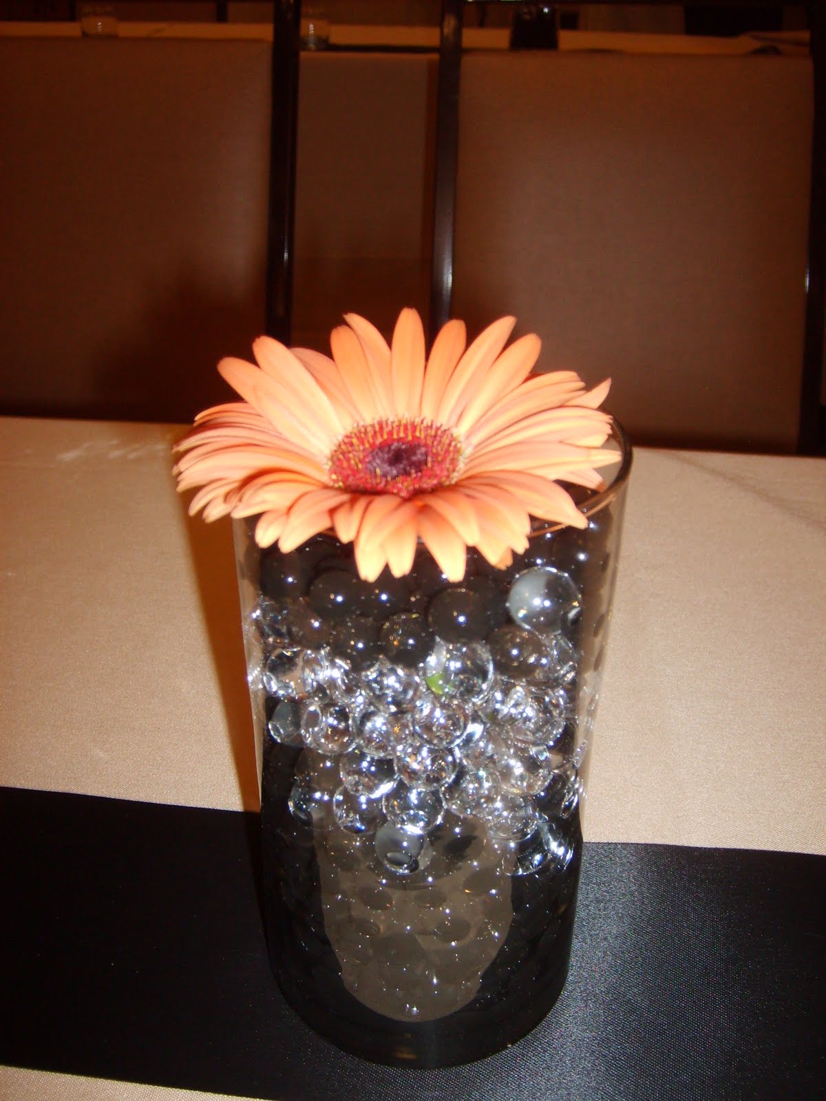
Here are some pictures from past events...
2010: Recently, Modern Display has begun working with A&S to create the Memorial area. I still do the flowers, but they created the backdrop showcasing the key artpiece of the year as well as the names of those included in the memorial. I think this year's turned out beautifully. (Last years wasn't bad either but alas I have zero pictures of it.)


2008: I am bummed about this particular year's event for a couple reasons. First, the flower supplier got my order wrong so I went over budget by quite a bit trying to make it work last minute. Second and most importantly, because it actually looked fantastic and this is pretty much the only crummy picture I got of it before my camera battery died. You can't tell that it looked great- $50 cameras just don't cut it! I had my sweet crew of helpers spray branches black and we strung chandelier bling from them until we ran out, and then we had to string up some of the faux ice from the high boy tables to finish the last few trees that we kept far from the spotlight. The color scheme for this was red, white and black with silver and crystal accents because it was an anniversary milestone year for CNS, an anniversary event for A&S, and was the last black tie dinner before changing over to an artist reception.

2007: The debacle year of recycling. The staff pulled from storage birdcages, peacock feathers, tall skinny vases, and low bowls, and asked me to please try to figure out how to keep costs down by using those items. They had selected a painting that had a lot of red, orange and yellow along with a hint of purple and turquoise in it as their key art piece- I drew my color palette from that (and have every year since.) I don't care for most of it personally, but I love how the flowers in the ice sculpture turned out! Sorry for the fuzzy birdcage picture. Maybe I should apologize for all the centerpieces but I will say this- the flowers inside the hideous birdcages were gorgeous!


Planning has already begun for next years event, and I know it'll be even better than last years. I'm telling you, each year I learn more and do a better job. Plus my little crew- Mary and Vince- are amazing at following my lead, reading my drawings, and copying me. Thanks to them for all of their help- I'd be a complete disaster without them at A&S.
These are awesome Lady! I love what you do within your limitations.
ReplyDelete